Graphical Representation of Pay-Offs
Last Updated on 28. April 2023 by Martin Schuster
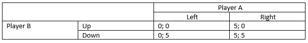
In some cases, it helps to draw the pay-off options in a chart. For that purpose, let’s consider the following pay-off matrix.
If we don’t consider transferrable utility, the graphical representation looks like that:
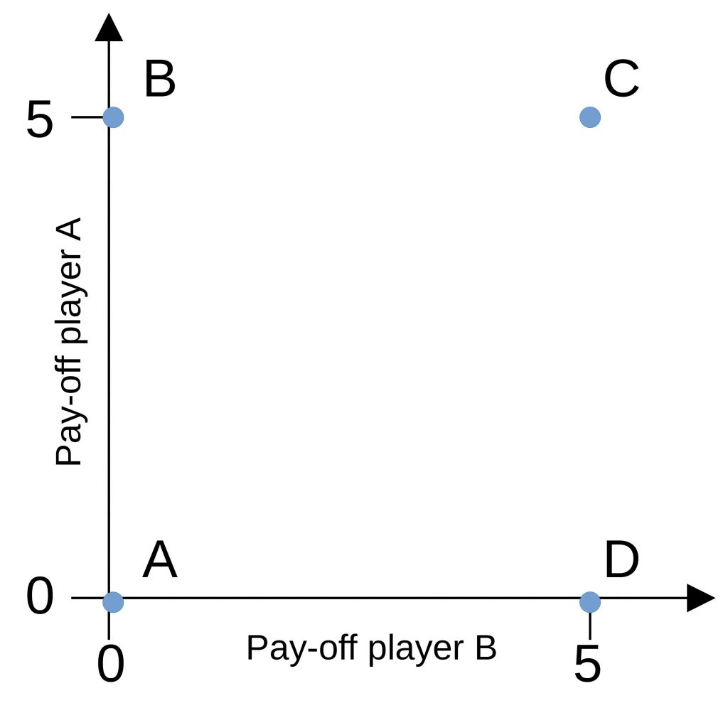
All four strategy combinations are possible. They are depicted as points A, B, C, and D. Values between those points are not possible to reach if there is no transferrable utility.
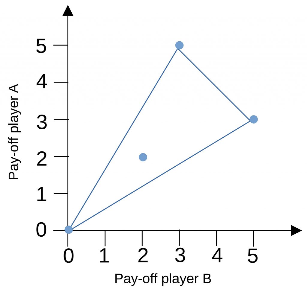
The situation changes if we allow transferrable utility. Now, we have a continuum of pay-offs. All pay-off combinations in the hatched area are possible.
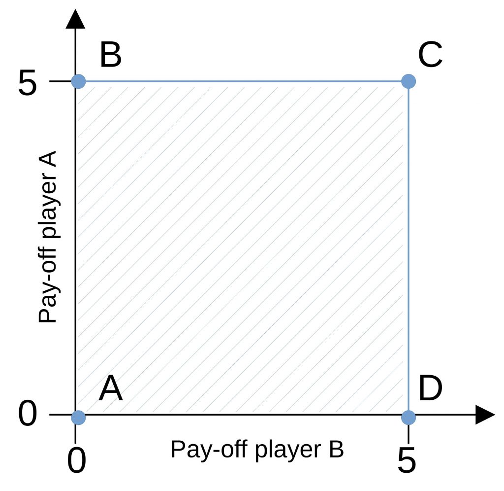
While now all combinations are possible, only the edges are Pareto-efficient. This means there is nothing wasted. The definition of a Pareto-efficient edge is that nobody can be better off without impairing someone else.
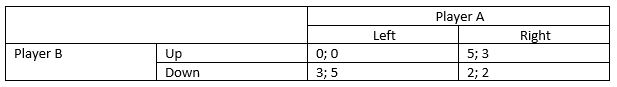
If we consider transferrable utility, we need to be careful to draw the pay-off space. Let’s consider the following pay-off matrix.
Drawing the points in a chart looks like that.
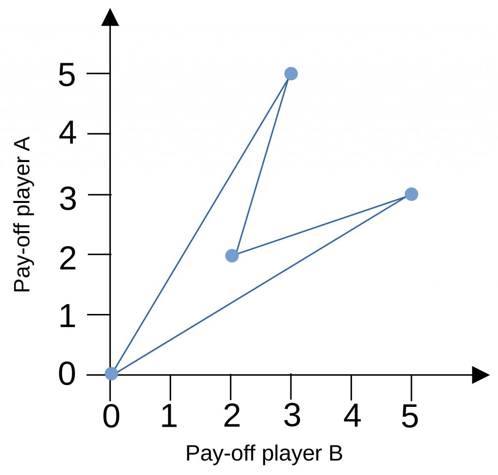
But that’s misleading. Also, value combinations between points can be reached. The chart looks like that.

 Register
 Sign in